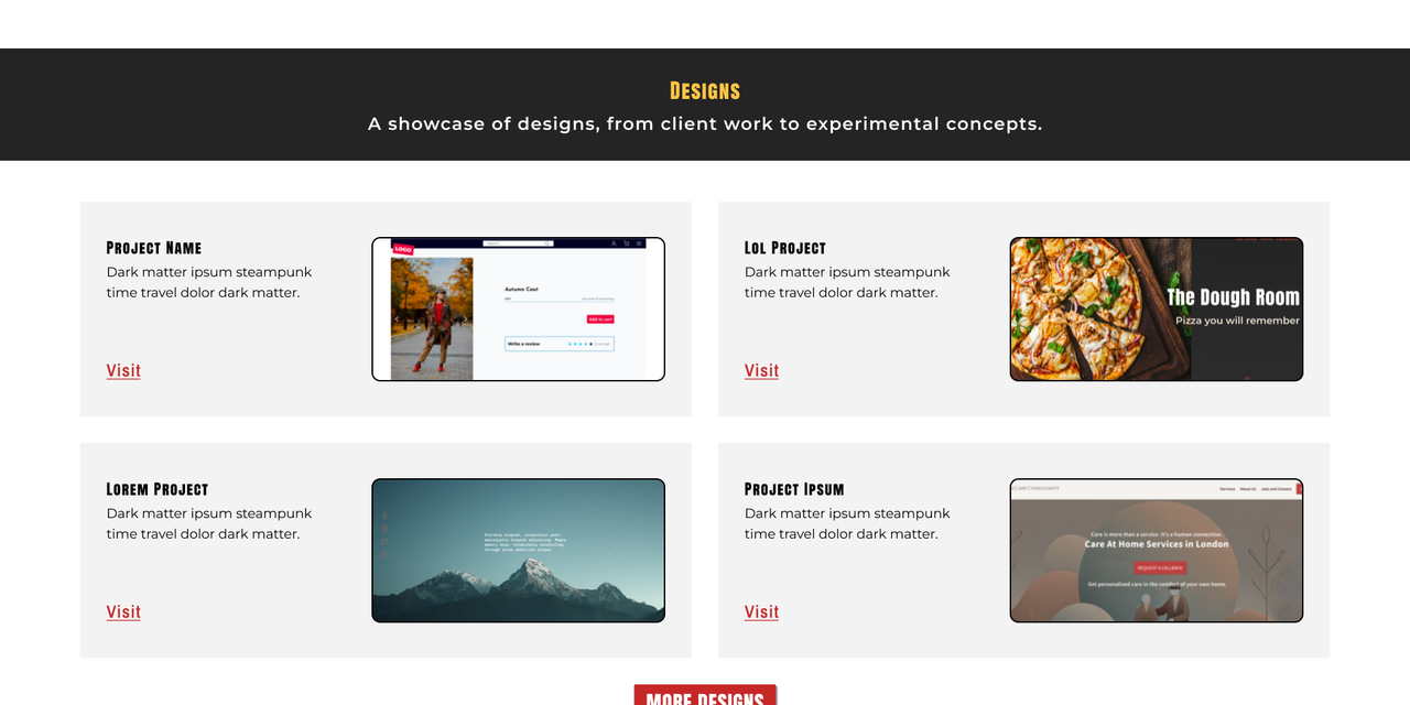
I rebuilt my own portfolio to better reflect the work I actually do: professional, functional, and approachable. The old site was built quickly and leaned too heavily on visual effects. This version focuses on clean design, intentional color choices, and a proper mobile experience, backed by solid infrastructure I set up and maintain myself.
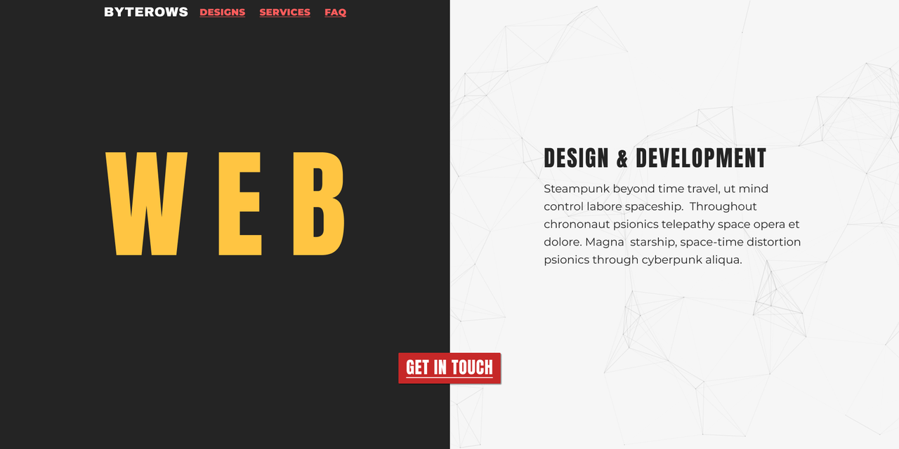
My original portfolio was built in a hurry. I designed it desktop-first, which meant the mobile version felt like an afterthought: disconnected from the desktop experience and awkward to use. Visually, it was too flashy: vibrant pinks, heavy effects, more like a personal art project than a professional portfolio. It looked cute, but it didn't give off the credibility I needed to attract actual clients.
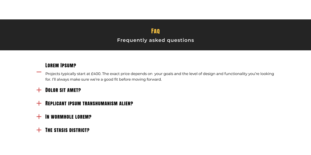
This version uses a restrained palette: grays, dark browns, black and white, with strategic pops of yellow for headings and red for buttons. I added subtle JavaScript particles in the background and used shadows intentionally rather than everywhere. The goal was professional without being boring, clean without being sterile. This time, I built mobile-first, making sure the experience worked across devices instead of trying to retrofit it later.
I deployed the site on a root server I configured from scratch, setting up the server, hardening security with proper firewall rules, configuring the database, and handling email setup. This isn't just a portfolio sitting on shared hosting; it's built on infrastructure I control and maintain, which lets me experiment with features and optimize performance without platform limitations.
Wagtail CMS content management and page building
Python/Django backend framework and CMS
Tailwind CSS styling and responsive design
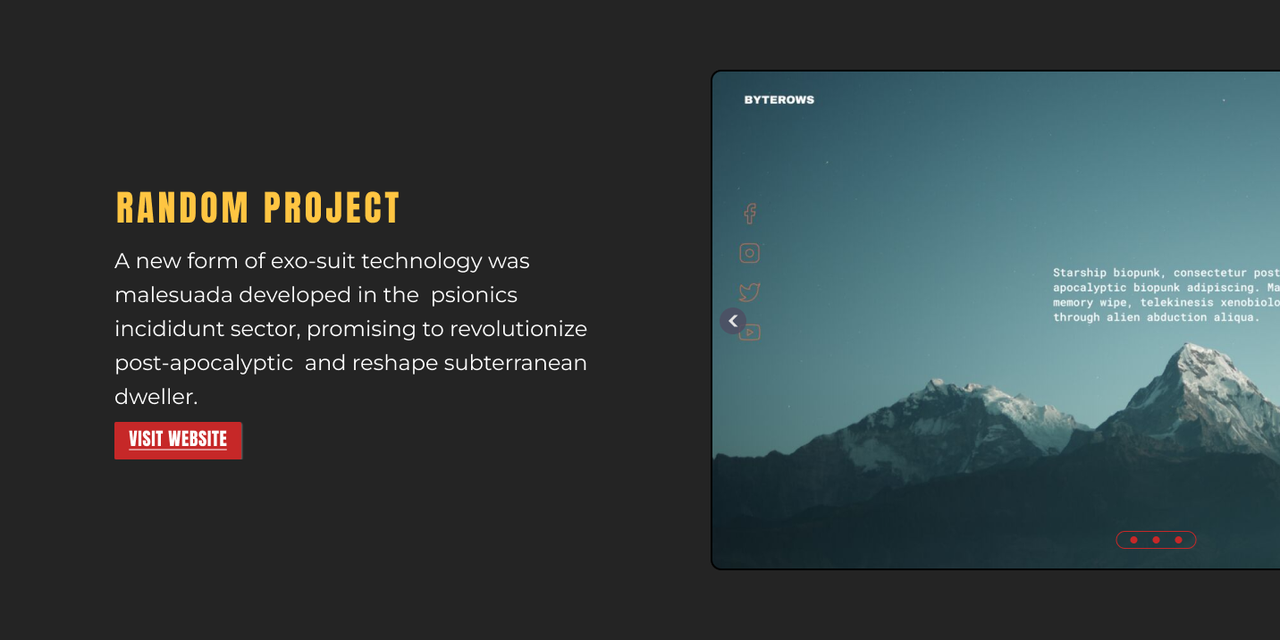
JavaScript particle effects, image carousel, menu interactions
PostgreSQL database
Root server custom deployment, firewall configuration, email setup