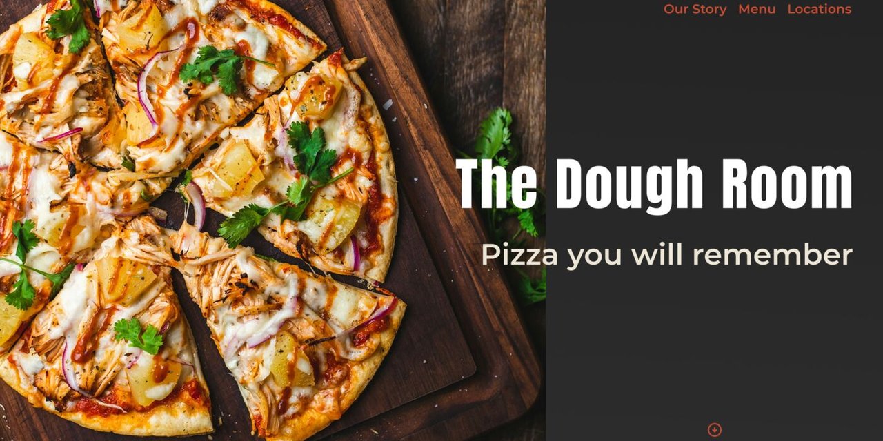
A pizza restaurant landing page concept exploring bold typography and clean information hierarchy. Built in Figma to test how oversized text overlapping imagery could work in a restaurant context - prioritizing food, ambiance, and easy booking without overwhelming visitors.
Restaurant websites are often cluttered or bury the important stuff - menu, vibe, how to book. This concept focuses on guiding visitors through the information smoothly while keeping the design bold and engaging.
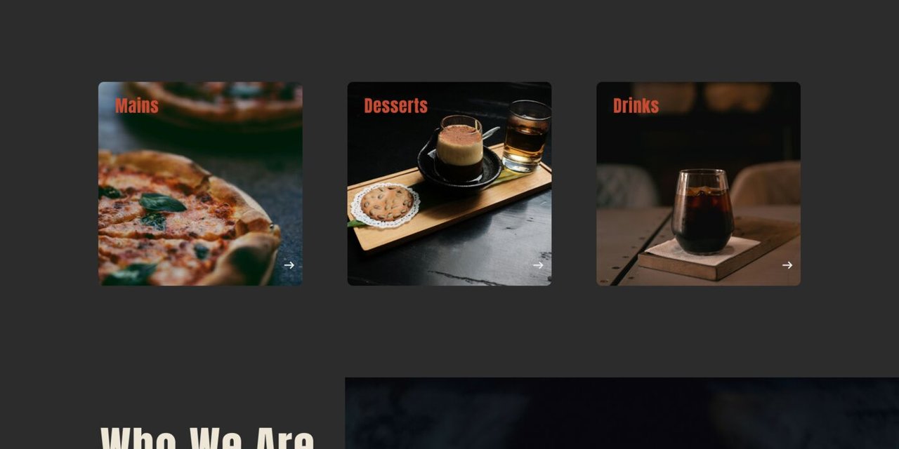
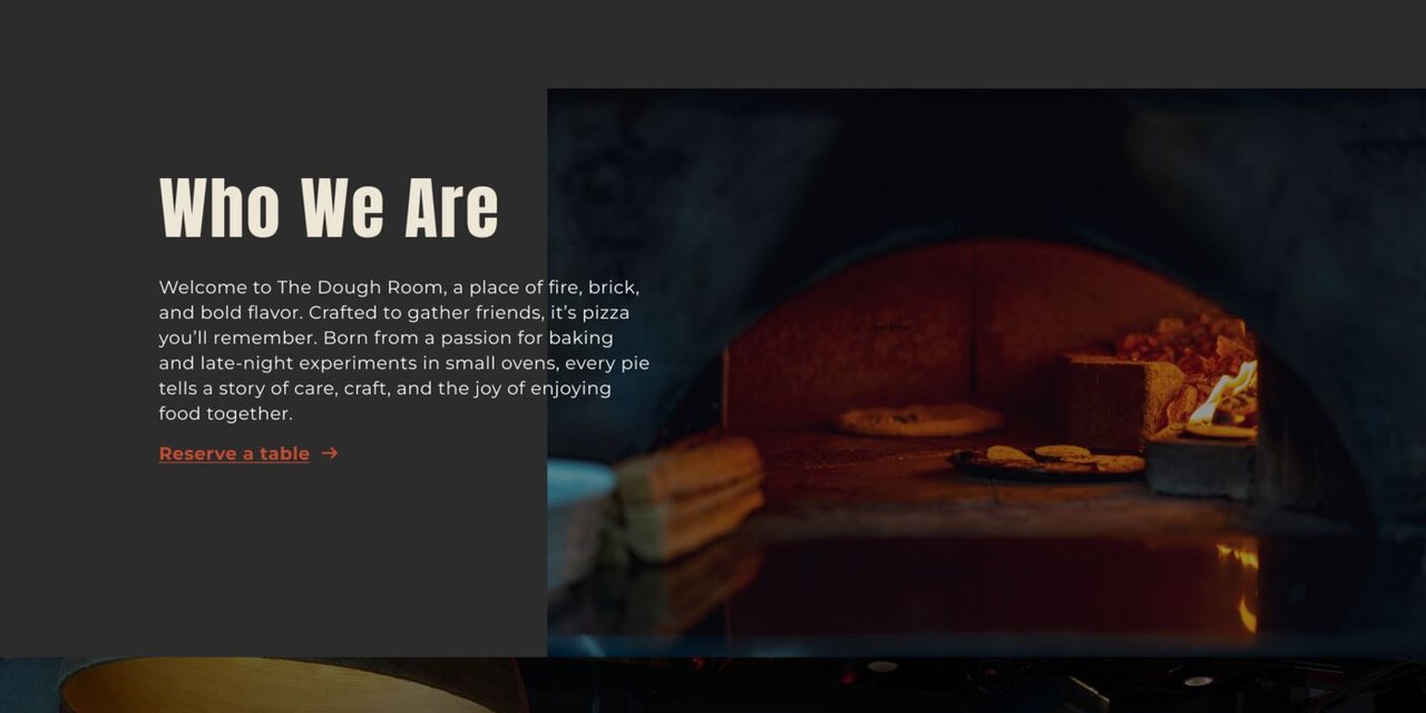
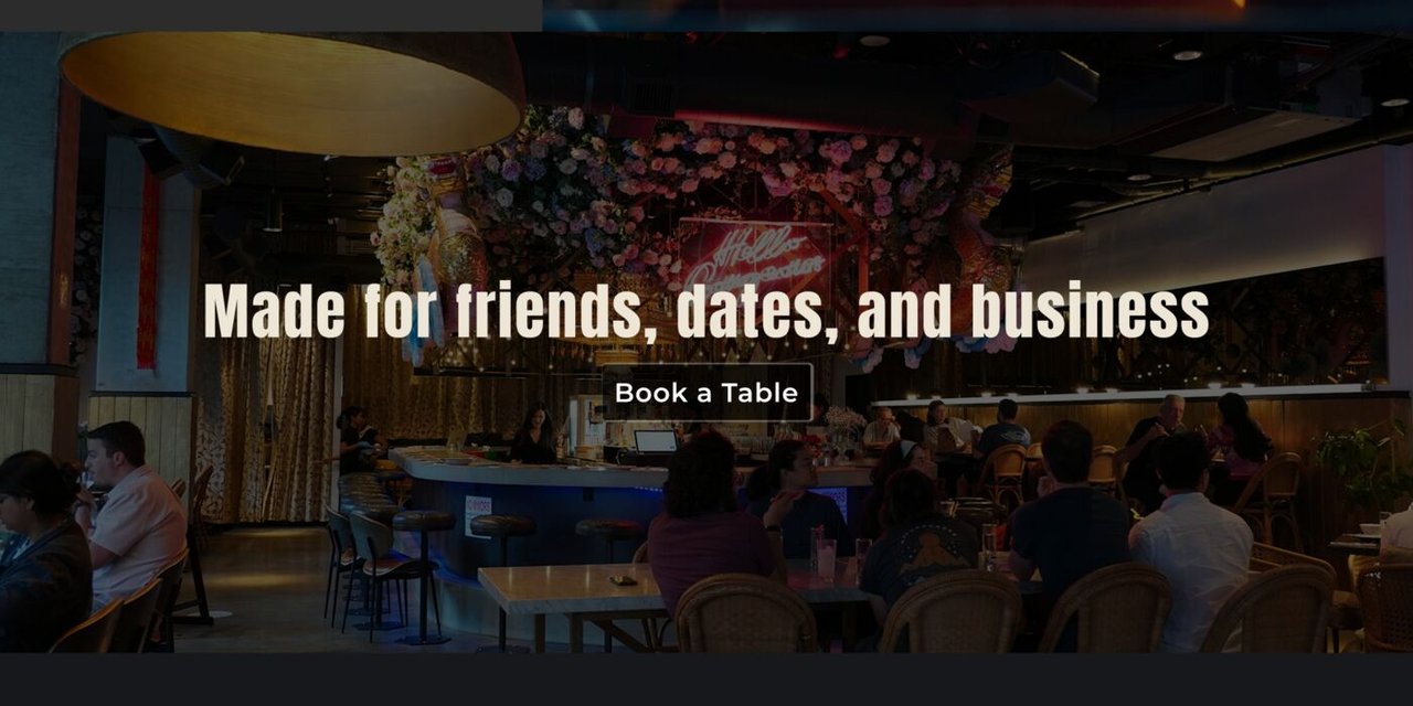
The layout uses large overlapping typography (100+ pixel headlines straddling images and backgrounds) to create visual interest without sacrificing readability. Each section alternates the image/text placement to maintain rhythm.
The design prioritizes what actually matters: showing the food and space clearly, hinting at the menu without overwhelming, and making it easy to book a table.
Figma Design and layout mockup